
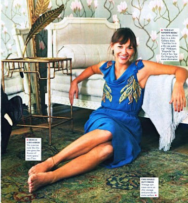
How could I have missed this??
I think the circus theme is just too much fun. One of my favorite books is Water for Elephants, which I hear is being made into a movie...can you imagine how imaginative and colorful the sets on this movie would be?

What if you and your family lived in a real life circus? (no, not as carnies) What we mean is, what if your home was originally the winter headquarters for John Robinson's Circus (back in 1840) and your address was One Circus Place?
Hey, it could happen! At least it did for the Worples' family. I will never forget this entertaining story that was in Traditional Home not too long ago.
 Who would have thought that this normal looking Terrace Park, Ohio home would house such interesting roots?
 The family said that they have definitely embraced the circus theme because of the home's history...and it's certainly apparent in their home! Brightly colored solid fabrics as well as lively contemporary prints adorn their furniture. They have taken the circus theme and modernized it in a whole new way.
 Raspberries, lime greens, aquas, and hot pinks are everywhere! Hot pink velvet chairs above are Designer Guild and the ottoman is upholstered in a Manuel Conovas striped fabric.
 What a fun house to grow up in! These rooms have so much vibrancy. As you can see, the homeowners interjected small accents of circus memorabilia without clowning around too much.
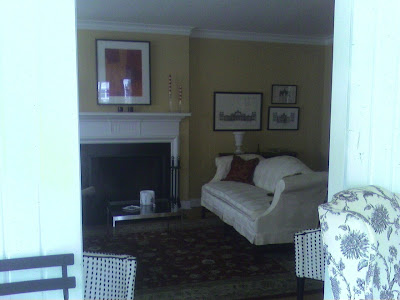
 The family room is equally as fun as the rest of the house! Bold and vivid, I wouldn't have any problem hanging out in here.
I love this wall color!
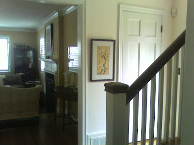
 The landing's curtains provide that extra jolt of color in the small space.
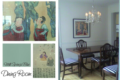
Harlequin vases on the dining room mantle provide some circuis flare! (they were given to the homeowners by their interior designer)
 I wouldn't recommend the circus theme in a normal residence; however, it definitely works here!


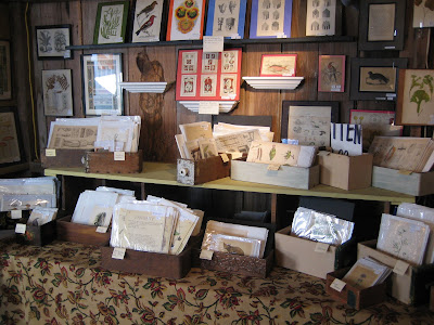
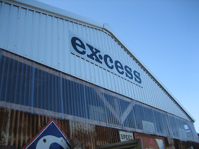 If there is one word to sum up my sentiments of the
 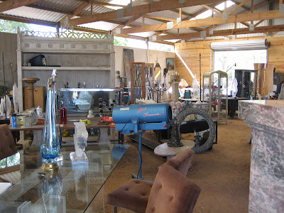 At "Excess," I found this barn filled to the brim with industrial-chic-modern finds. A nice breath of fresh air when you've been looking at gorgeous antiques you can't afford and sorting through the junk you can. I would describe this vendor as Anthropologie on crack.

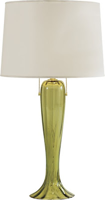
 He had lots of gorgeous (expensive) lamps as well.
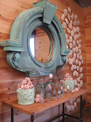 On the right hand side of this picture, note how he hung white coral all the way up the wall - very dramatic in person.
 The
The 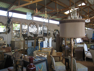
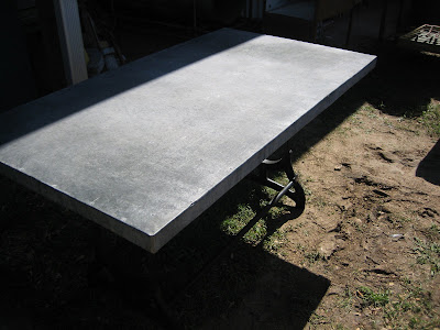
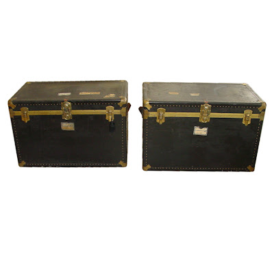
 This one booth had loads of zinc tables, I could think of a thousand possibilities and functions for them.
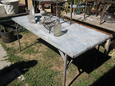
 It amazes me that these "stores" only set up shop twice a year. It took the owner of Clutter three weeks to get everything set up.
 Any kind of print you could imagine was available.
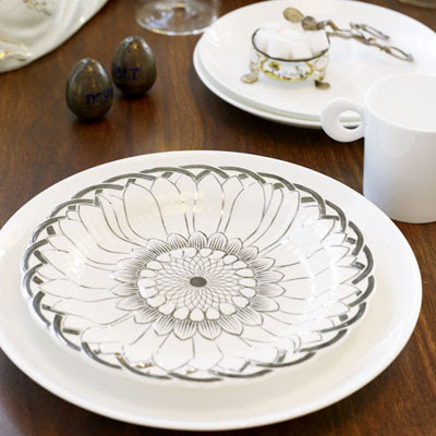
 SOOO many cute dishes!
 A screen I contemplated as a headboard, but decided against because that's not what I ultimately want.
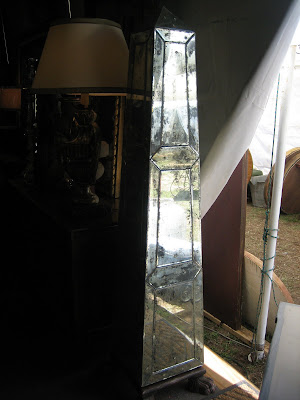 I saw several of these large mirrored obelisks - amazing!
 Small sunburst mirror I passed up (I really want a pair).


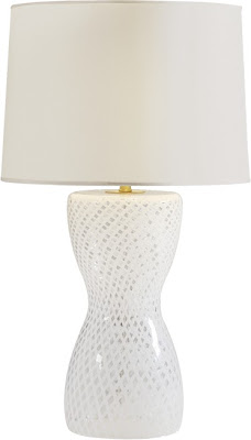
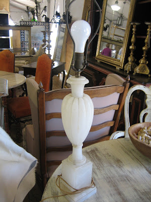 I loved the lines of this alabaster lamp.


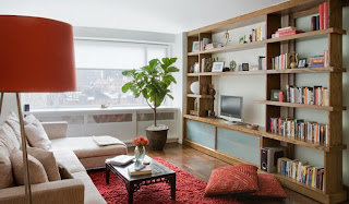
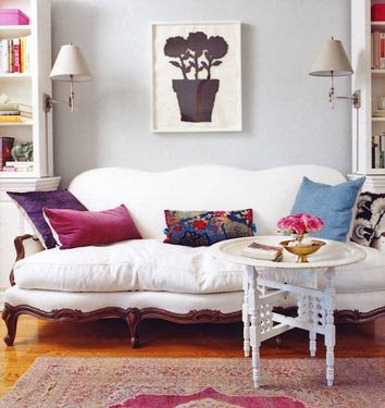 Her symmetrical arrangement is perfect- two bookshelves flank a dainty white sofa.
 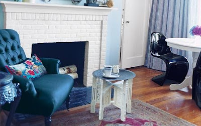 I love her black Panton chairs- incredibly chic!
 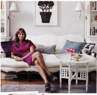 She managed to combine a bunch of different styles in her apartment and make it all look so seamlessly put together.


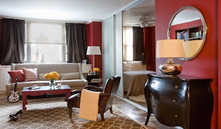
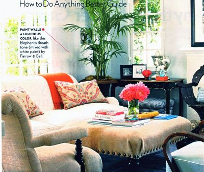 This living space looks so comfortable and provides a great place for guests to go and mingle (Rashida likes to entertain a lot). Walls are Elephant's Breath by Farrow and Ball.


 I really really wanted these chairs- but alas, there were only three and I think they are a different shade of white than my dining table. They were marked down to $150 each! Someone go snatch them up!
 These cane back chairs were only $50 something dollars each! You'd need to recover the seats as most of them were needing repair, but what a deal!
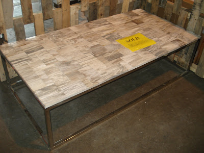 This table is just gorgeous in person- too bad it's already SOLD!
 More and more console tables!
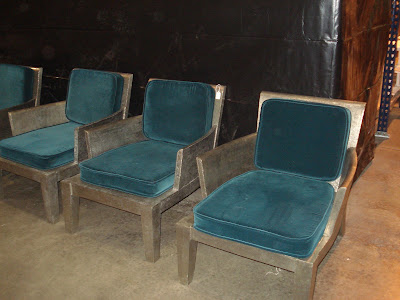 Joe, one of Wisteria's employees, was kind enough to walk me around the warehouse and make sure I saw every inch of bargain! Thanks Joe! He loved these Art Deco-esque chairs..and for $99 each! You could even get new cushions made for them- imagine the possibilities!


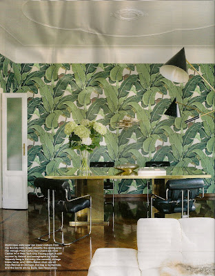
 This signature banana leaf wallpaper has been there since the 50's and was chosen by decorator Don Loper.


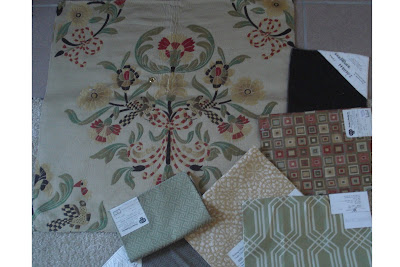


 Left: Green sectional fabric (existing)


 Kim, you are all dressed up for us- you shouldn't have!


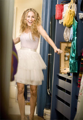
 Decisions, decisions...Jamie Lynn Sigler wonders what to wear on her date with Entourage's "Turtle"!
 I don't think she will have a problem finding the right shoes!
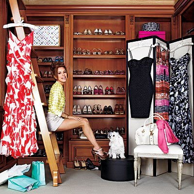
  I bet baby Harlow's closet is just as big as her fashionista mom's!
 Jessica trying on shoes in her closet (featured in In Style). I don't think she has enough hats?!
 Kimora's closet is crammed with things! At least her closet gives off a homey vibe with a leopard print carpet, Louis side "table", and antique chaise.

 And America's cutie patootie, Eva Longoria. We'll let her have as many shoes as she wants, she's just so adorable.
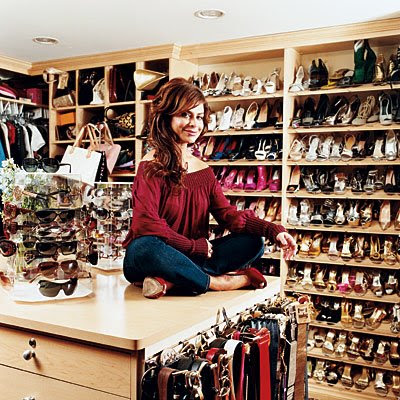 I'm not sure why Paula keeps buying more clothes because she ends up on the worst dressed list in Us Weekly at least once a week. She needs Tim Gunn to come over and do some spring cleaning in that closet!
  But it is really only one "angle" seen in two ways! This modern twist on the age old "silhouette" is the work of Chicago photographer and artist,


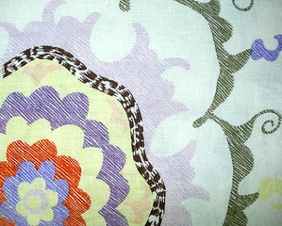
 This floral
  Like we always say, it's good to mix natural, more rough materials with sleeker ones. That is why I love this
  More fun fabrics...this one is their
 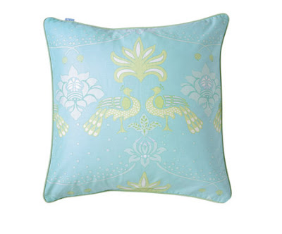 So very cute!! I love the peacock print on the


 Yellow and blue aren't two colors that I'd normally think to put together, but it looks really pretty and works well here. It could be the fact that they paired them with a bunch of muted cream accents. Do you think if the walls were anything but cream it would have still looked this tranquil? The rug, roman shade, accent tables, and lamp all seem to disappear into the background and let the colorful chairs, sofa, and pillows take center stage.
  Yellow tables mixed in with green chairs, green lamps, and a pink sofa? Done and done! These homeowners aren't afraid of a little color and show this Victorian home who's boss!
 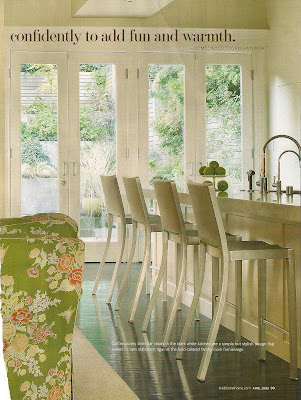 Sleek metallic bar stools provide a modern flair.
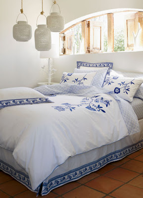
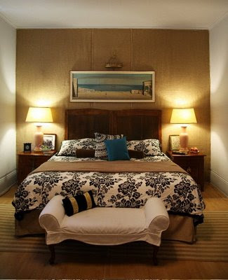
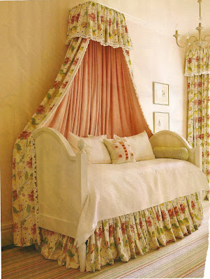 Such a happy place to sleep!


 This
This  This
This 
 This piece is my favorite (I told you that this list was in no particular order!) The Dunstan
 This
This 
 These
These  Some of you love it, some of you hate it, but the fact of the matter is that
  This
This  This
This 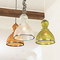 Such fun pendants! The
  The
The  I think pleated silk shades on


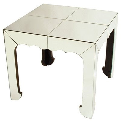
 {Pair of

 {
{ {
{ {
{

 {
{


 {
{ {
{ {
{


 What Victoria pieces do you have in your home, if any- the steal or the splurge?


.jpg)


 Add in some mirrored glass and paint it white for an updated crisp look
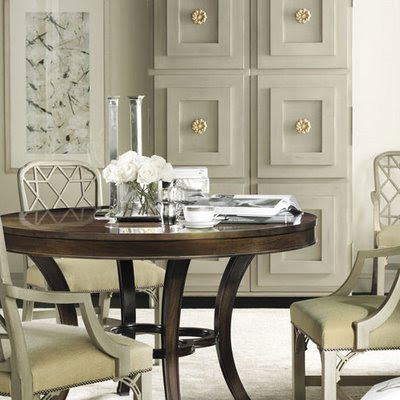 Love this gray armoire (and the hardware) in this dining room by Hickory Chair.
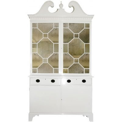
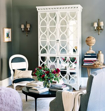
 Windsor Smith designed this room (one of my all time favorite rooms). A white mirrored armoire in the corner is the perfect touch to this space.

 This painted and distressed French armoire from French Country Living, looks right at home in this space. Aside from standing there and looking pretty, it serves a purpose too! It holds linens.

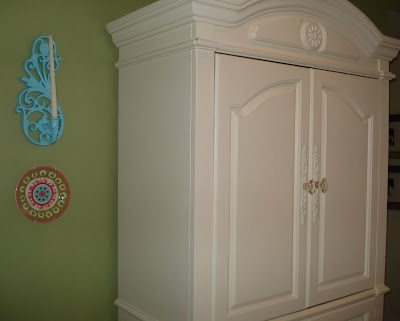
 These glass-paned geometric, white armoires really seem to be everywhere! We keep seeing them...another
  A Mary McDonald room...a black armoire displays classic and subtle accessories in the background.


 I love, love, love getting all new bedding. The new spring designs from my favorite bedding source,


 This is my favorite one (above).


 {This tech-savvy dog and I must have been separated at birth...}


 Master Bedroom with a fabric wall behind her headboard
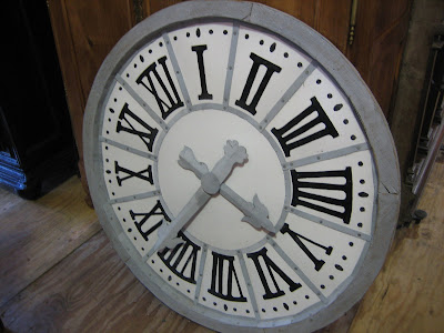
 Joni of Cote de Texas had a solution for her shutters- hang a wall clock!
 Here is her gorgeous front entry hall- light and airy, it pretty much makes me want to redo my entire house in creams, golds, and neutrals.
  She's an interior decorator who resides in Idaho and owner/writer of the

 Her colorful wall of letters is so much fun!
 Her dining room is very retro glam. A splash of red brings in a touch of color to the room and a pretty tone on tone wallpaper give the walls a little bit of a sheen.
  I am so completely obsessed with glass tiles and the black, white and gray of hers provide the backsplash with a nice graphic punch. What a perfect backdrop for yellow and white salt and pepper shakers!


 "Le Garage"- once a plain ordinary garage, now the beautiful M21 showroom!


 The next blog belongs to Canadian Jessica Claire. That name might ring a bell as her well known lifestyle blog is called
  Where do bloggers spend 90% of their time? Their desk! Jessica showed us pics of her work space/bedroom area. (Having them be one and the same makes it just that much easier to wake up in the middle of the night and check your email! Yes, I do that)
  I spy a ghost chair!! Jessica's graphic and continuous color scheme of black and white gives the room some edge while punches of orange provide a nice colorful accent to the room. I love the sloped ceiling- makes the room look so cozy.
 We love
  AFTER:
 The hot red chair really pops against the cool turquoise walls.
 How much fun would a room like this be for parties and gatherings?
 Another friend of ours in the blogosphere is Joni of
  When I asked her to send photos of her home, she sent me her bedroom and said "I don't know why you'd want it- yuk"...is she crazy? It's beautiful! I love the color of her bedroom- it's so soothing.
 Joni loves her electric sconces! And they must always be on too! Her little desk area is so quaint. Her guest bedroom and daughter's bedrooms are just as pretty too- I have a feeling her guests feel right at home when they visit!
 She's a huge fan of slipcovers too!

 I love her idea here of putting art above doors- it draws the eye upwards and gives the visitor something interesting to look at- most people would have left it blank- but Ronda's house is all about the details.
 All of her accessories are perfectly placed. A nice balance of taller objects with lower objects.
  How quiet and peaceful does her sitting area look? Curl up with a good book (or laptop) and Ronda seems to have it made in this little nook! Lots of natural light and a nice view complete the space.
 I got a lot of really awesomely bad entries for my "Ugliest Bathroom Contest." It was a tough decision, but you really can't beat big game "Out of Africa" wallpaper paired with brown plumbing fixtures.


 The bathroom is very small, leaving no room for sconces on both sides of the mirror, so I had to use of own my favorite lights, the


 I found a short bio on
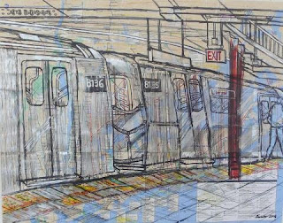
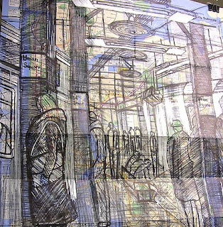


 The work above is of a homeless couple Enrico came across. There is brief description of his experience drawing them and an excellent article about Enrico and his life at the


 Look at the beautiful detailing on her
  I usually seem to steer away from yellow, but not in this case. Just a dollop of yellow here puts the colorful icing on a more muted cake. The cream walls and darker furnishings tone down the bright pillows. I'd honestly be afraid to step foot in this room and disrupt its symmetrical perfection!
  Here's a closeup of those uplifting sunny yellow pillows...
 How come no one has thought of this before? And in unlacquered brass, no less! This wastebasket with handles would make it sooo much easier to take out the trash...in style too!
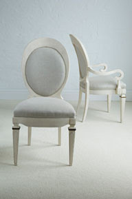 And my next favorite chair on the website-
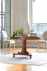


